XP INC. • 2018
XP INC. • 2018
XP INC. • 2018
Building a new experience for an investment app
Building a new experience for an investment app
Building a new experience for an investment app
Building a new experience for an investment app
Building a new experience for an investment app
During my time at XP, I led the design team responsible for the new company app. Our goal was to rethink and restructure the recent-launched MVP with a new experience lined up with brand strength and user goals. My responsibility was to set a product strategy with the Product Manager, rethink information architecture in a scalable way, design interfaces and prototypes, conduct user research, and make design and development decisions with the squad.
During my time at XP, I led the design team responsible for the new company app. Our goal was to rethink and restructure the recent-launched MVP with a new experience lined up with brand strength and user goals. My responsibility was to set a product strategy with the Product Manager, rethink information architecture in a scalable way, design interfaces and prototypes, conduct user research, and make design and development decisions with the squad.
During my time at XP, I led the design team responsible for the new company app. Our goal was to rethink and restructure the recent-launched MVP with a new experience lined up with brand strength and user goals. My responsibility was to set a product strategy with the Product Manager, rethink information architecture in a scalable way, design interfaces and prototypes, conduct user research, and make design and development decisions with the squad.
During my time at XP, I led the design team responsible for the new company app. Our goal was to rethink and restructure the recent-launched MVP with a new experience lined up with brand strength and user goals. My responsibility was to set a product strategy with the Product Manager, rethink information architecture in a scalable way, design interfaces and prototypes, conduct user research, and make design and development decisions with the squad.
During my time at XP, I led the design team responsible for the new company app. Our goal was to rethink and restructure the recent-launched MVP with a new experience lined up with brand strength and user goals. My responsibility was to set a product strategy with the Product Manager, rethink information architecture in a scalable way, design interfaces and prototypes, conduct user research, and make design and development decisions with the squad.
Context
Context
Context
Context
Context
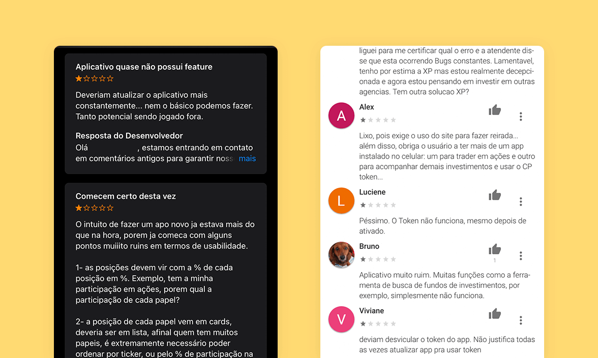
In the last 2017 quarter, XP launched the MVP of their new app, "Minha Carteira XP". It was a simpler visualization of user investments in which they could consult their Token to access their account on the web and edit their profile. The app didn’t have main features such as making investments and withdrawals. Moreover, three of the five tabs were with "soon", there was a lot of design inconsistencies and the development wasn't native, spoiling the app in several ways. The result was visible in App Store and Google Play app ratings.
Against these facts, in early 2018, XP decided to start a new native development (iOS and Android), besides to increase the experience and add new features to a more complete MVP.
In the last 2017 quarter, XP launched the MVP of their new app, "Minha Carteira XP". It was a simpler visualization of user investments in which they could consult their Token to access their account on the web and edit their profile. The app didn’t have main features such as making investments and withdrawals. Moreover, three of the five tabs were with "soon", there was a lot of design inconsistencies and the development wasn't native, spoiling the app in several ways. The result was visible in App Store and Google Play app ratings.
Against these facts, in early 2018, XP decided to start a new native development (iOS and Android), besides to increase the experience
and add new features to a more complete MVP.
Minha Carteira XP app - Old version
APP STORE
APP STORE
APP STORE
APP STORE
“The app only checks balances, it's not possible to do anything more like make investments, see account statements, compare investments, finally, it doesn't substitute the web platform."
“The app only checks balances, it's not possible to do anything more like make investments, see account statements, compare investments, finally, it doesn't substitute the web platform."
“The app only checks balances, it's not possible to do anything more like make investments, see account statements, compare investments, finally, it doesn't substitute the web platform."
“The app only checks balances, it's not possible to do anything more like make investments, see account statements, compare investments, finally, it doesn't substitute the web platform."
“The app only checks balances, it's not possible to do anything more like make investments, see account statements, compare investments, finally, it doesn't substitute the web platform."
GOOGLE PLAY
GOOGLE PLAY
GOOGLE PLAY
GOOGLE PLAY
“What is the reason to launch an investment app if it’s available nothing besides the balance? Poor company’ strategy because the app will only be negatived :("
“What is the reason to launch an investment app if it’s available nothing besides the balance? Poor company’ strategy because the app will only be negatived :("
“What is the reason to launch an investment app if it’s available nothing besides the balance? Poor company’ strategy because the app will only be negatived :(“
“What is the reason to launch an investment app if it’s available nothing besides the balance? Poor company’ strategy because the app will only be negatived :(“
Research
Research
Research
Research
Our first step was to do immersive research. We wanted to understand better the financial market context, our competitors strengths and weaknesses, the recently launched app usability and design problems, user thoughts, habits and goals, the best practices in the market and what have happened during the app development and their learnings.
Our first step was to do immersive research. We wanted to understand better the financial market context, our competitors strengths and weaknesses, the recently launched app usability and design problems, user thoughts, habits and goals, the best practices in the market and what have happened during the app development and their learnings.
Our first step was to do immersive research. We wanted to understand better the financial market context, our competitors strengths and weaknesses, the recently launched app usability and design problems, user thoughts, habits and goals, the best practices in the market and what have happened during the app development and their learnings.
Our first step was to do immersive research. We wanted to understand better the financial market context, our competitors strengths and weaknesses, the recently launched app usability and design problems, user thoughts, habits and goals, the best practices in the market and what have happened during the app development and their learnings.
Desk Research
Desk Research
We searched for information and data about the financial market. Users want quick and easy actions that follow their rhythm and a personalized and unique experience based on their profile.
We searched for information and data about the financial market. Users want quick and easy actions that follow their rhythm and a personalized and unique experience based on their profile.
We searched for information and data about the financial market. Users want quick and easy actions that follow their rhythm and a personalized and unique experience based on their profile.
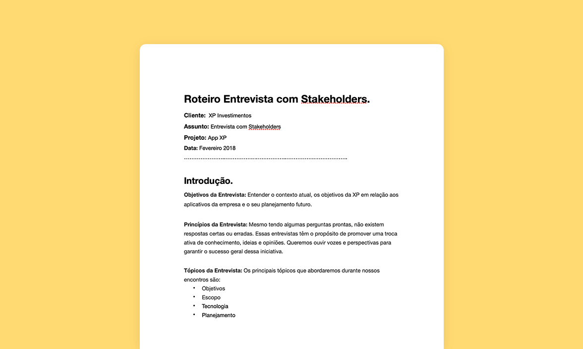
Stakeholder Interview
We talked with the developers responsible for the launched app to understand the difficulties, barriers and learning they had and with XP key stakeholders.
We talked with the developers responsible for the launched app to understand the difficulties, barriers and learning they had and with XP key stakeholders.
We talked with the developers responsible for the launched app to understand the difficulties, barriers and learning they had and with XP key stakeholders.
Apps Reviews
For a quick understanding of user thoughts, their goals and disappointments, we analyzed almost all reviews made at App Store and Google Play. We found that the recently launched app had a lot of technical problems, was very simple and without main features, and had no value proposition.
For a quick understanding of user thoughts, their goals and disappointments, we analyzed almost all reviews made at App Store and Google Play. We found that the recently launched app had a lot of technical problems, was very simple and without main features, and had no value proposition.
For a quick understanding of user thoughts, their goals and disappointments, we analyzed almost all reviews made at App Store and Google Play. We found that the recently launched app had a lot of technical problems, was very simple and without main features, and had no value proposition.
UX Analysis
We analyzed the recently launched app and mapped the main problems and potential improvements, as to remove the tabs "soon", create a design system and show the information in the clearest way.
We analyzed the recently launched app and mapped the main problems and potential improvements, as to remove the tabs "soon", create a design system and show the information in the clearest way.
We analyzed the recently launched app and mapped the main problems and potential improvements, as to remove the tabs "soon", create a design system and show the information in the clearest way.
Competitive Analysis
& Benchmark
We studied the main players of the national and international markets. We found that most of them focus on the Trader or the beginner. As a result, there is an opportunity to suit all investor profiles.
We studied the main players of the national and international markets. We found that most of them focus on the Trader or the beginner. As a result, there is an opportunity to suit all investor profiles.
We studied the main players of the national and international markets. We found that most of them focus on the Trader or the beginner. As a result, there is an opportunity to suit all investor profiles.
We studied the main players of the national and international markets. We found that most of them focus on the Trader or the beginner. As a result, there is an opportunity to suit all investor profiles.
Strategy
Strategy
Strategy
Strategy
Strategy
After the studies, researches and learnings, a new strategy for the XP app was necessary, a one that would be coherent with the company and users goals and that would guide the development and design process. Therefore, we established 4 main principles:
After the studies, researches and learnings, a new strategy for the XP app was necessary, a one that would be coherent with the company and users goals and that would guide the development and design process. Therefore, we established 4 main principles:
After the studies, researches and learnings, a new strategy for the XP app was necessary, a one that would be coherent with the company and user goals and that would guide the development and design process. Therefore, we established 4 main principles:
After the studies, researches and learnings, a new strategy for the XP app was necessary, a one that would be coherent with the company and user goals and that would guide the development and design process. Therefore, we established 4 main principles:
After the studies, researches and learnings, a new strategy for the XP app was necessary, a one that would be coherent with the company and user goals and that would guide the development and design process. Therefore, we established 4 main principles:
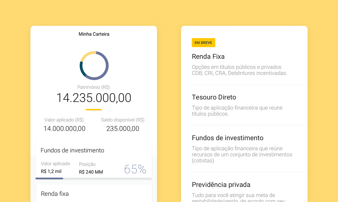
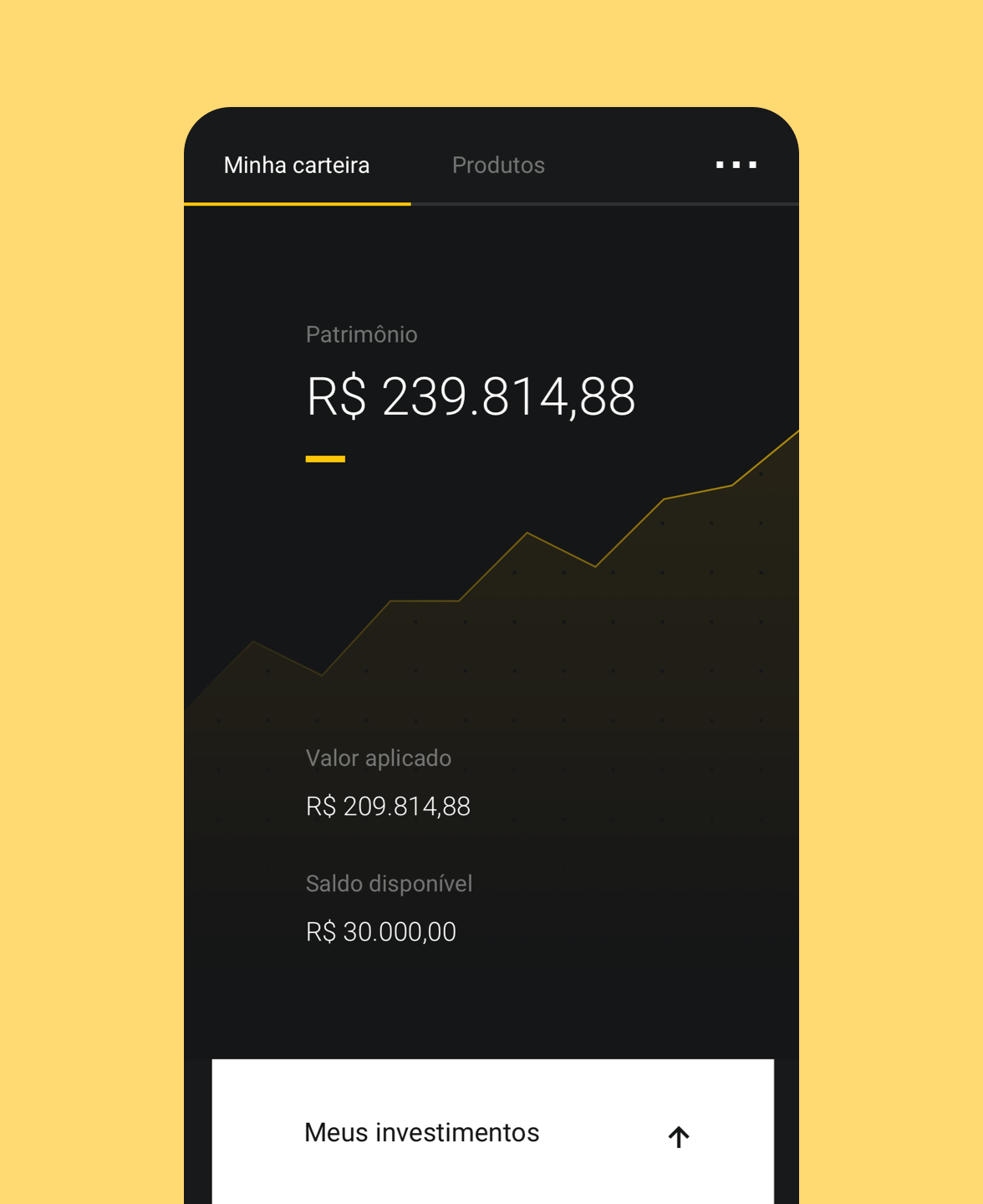
01 A clear vision of the full wallet (MVP)
02 Invest with quick actions (MVP)
02 Invest with quick actions (MVP)
03 Auxiliar content in the format of tips and automated support
03 Auxiliar content in the format of tips and automated support
04 Intelligence to a more personalized experience
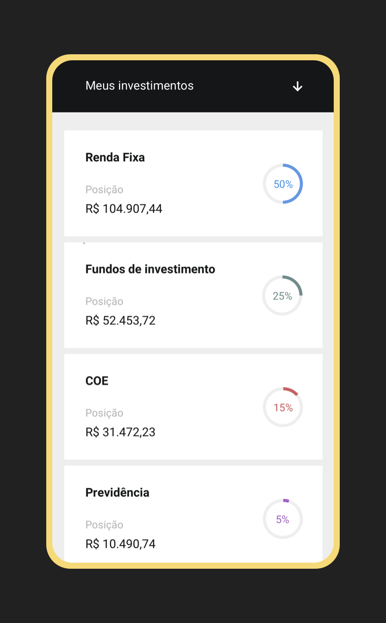
Besides, it was necessary to define the app and responsive website goals. The first one should be a simplified vision of the wallet with quick actions, ideal to access daily. The responsive website, a more complete and analytical overview of XP products, ideal for more detailed management.
Besides, it was necessary to define the app and responsive website goals. The first one should be a simplified vision of the wallet with quick actions, ideal to access daily. The responsive website, a more complete and analytical overview of XP products, ideal for more detailed management.
Besides, it was necessary to define the app and responsive website goals. The first one should be a simplified vision of the wallet with quick actions, ideal to access daily. The responsive website, a more complete and analytical overview of XP products, ideal for more detailed management.
Besides, it was necessary to define the app and responsive website goals. The first one should be a simplified vision of the wallet with quick actions, ideal to access daily. The responsive website, a more complete and analytical overview of XP products, ideal for more detailed management.
Structure
Structure
Structure
Structure
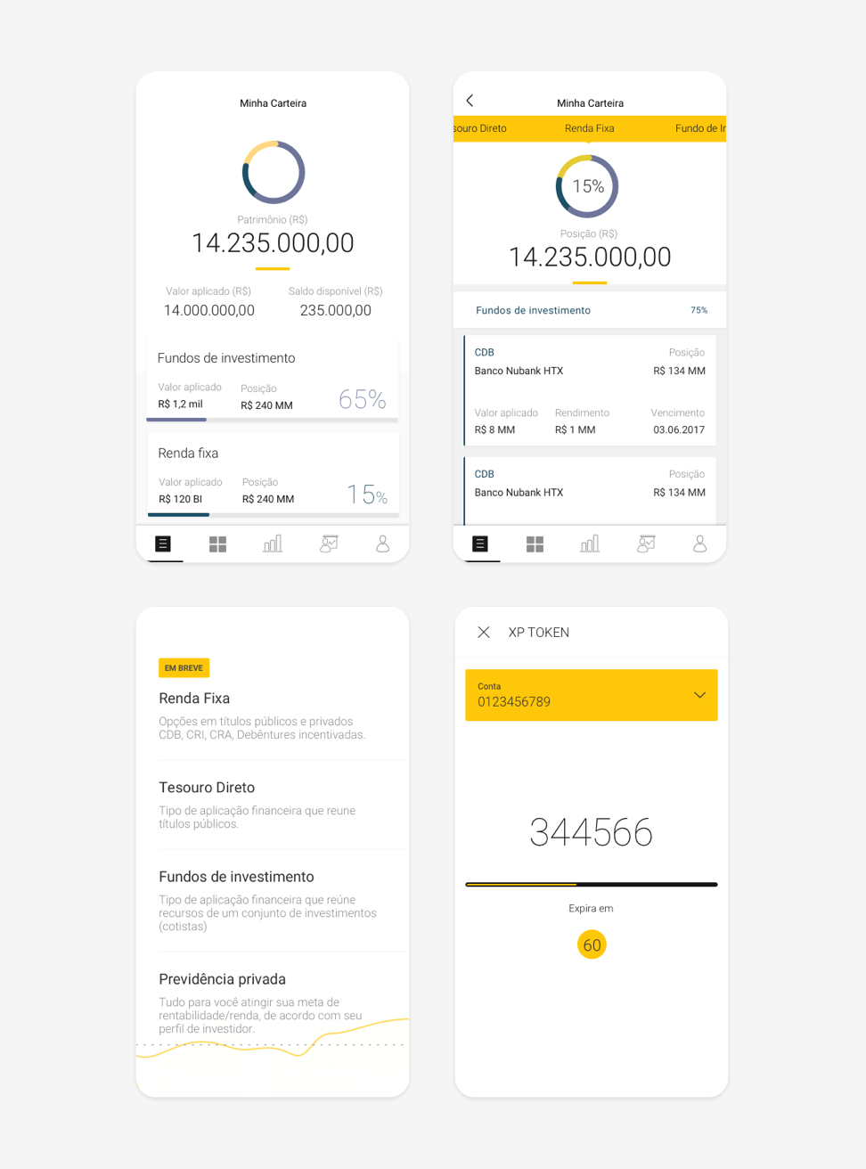
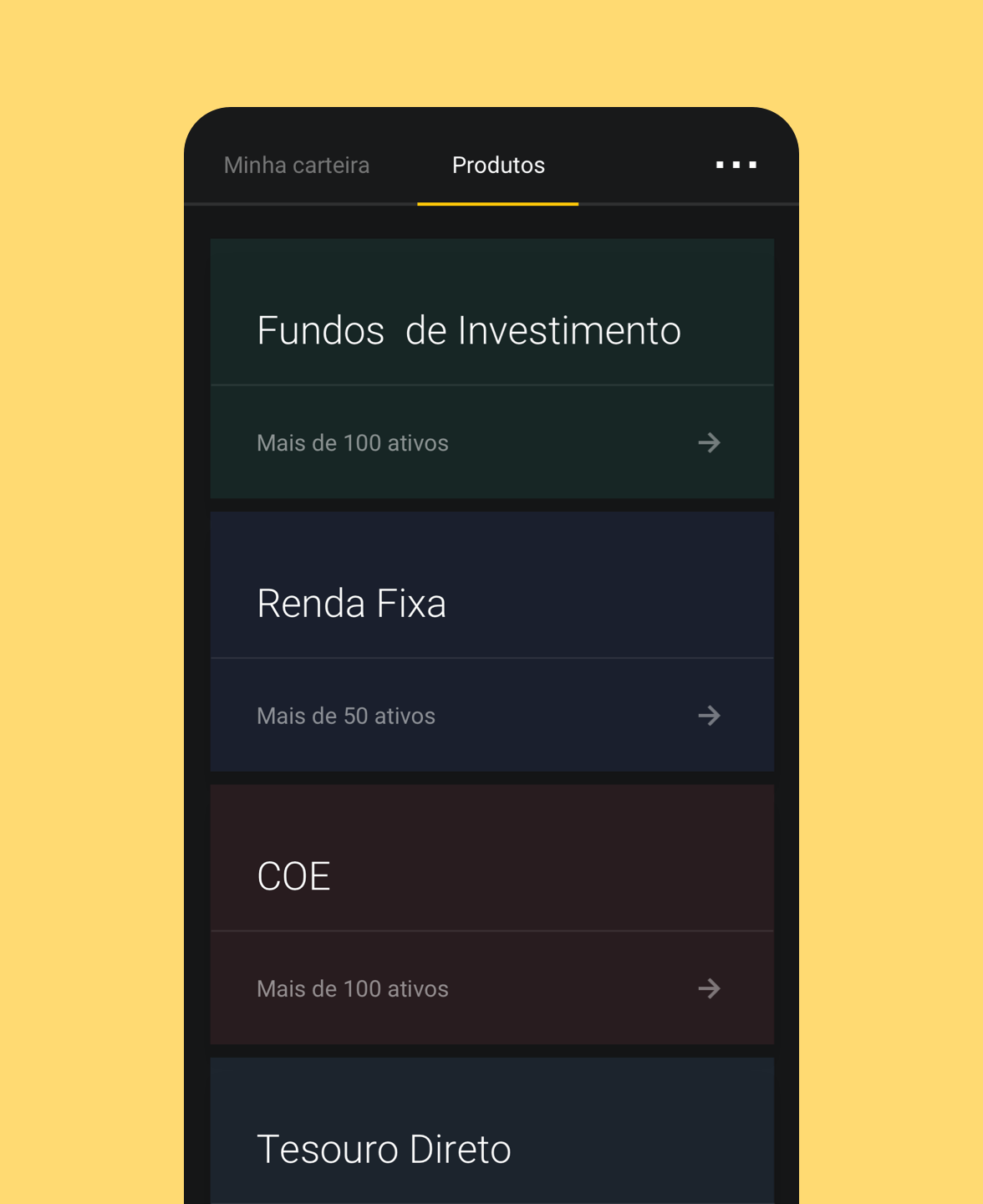
The main decision to restructure the information architecture was to prioritize the main user goals using the app: looking for the result of their investments and making more investments. Other actions are secondary and could be in a different area. Hence, the app navigation was split into "Minha Carteira" (follow the investments), "Produtos" (to invest) and "..." (secondary actions).
Another relevant part of the process was to map all the available product data. It helped to rank and prioritize cards and product investment pages.
The main decision to restructure the information architecture was to prioritize the main user goals using the app: looking for the result of their investments and making more investments. Other actions are secondary and could be in a different area. Hence, the app navigation was split into "Minha Carteira" (follow the investments), "Produtos" (to invest) and "..." (secondary actions).
Another relevant part of the process was to map all the available product data. It helped us to rank and prioritize cards and product investment pages.
The main decision to restructure the information architecture was to prioritize the main user goals using the app: looking for the result of their investments and making more investments. Other actions are secondary and could be in a different area. Hence, the app navigation was split into "Minha Carteira" (follow the investments), "Produtos" (to invest) and "..." (secondary actions).
Another relevant part of the process was to map all the available product data. It helped to rank and prioritize cards and product investment pages.
The main decision to restructure the information architecture was to prioritize the main user goals using the app: looking for the result of their investments and making more investments. Other actions are secondary and could be in a different area. Hence, the app navigation was split into "Minha Carteira" (follow the investments), "Produtos" (to invest) and "..." (secondary actions).
Another relevant part of the process was to map all the available product data. It helped us to rank and prioritize cards and product investment pages.
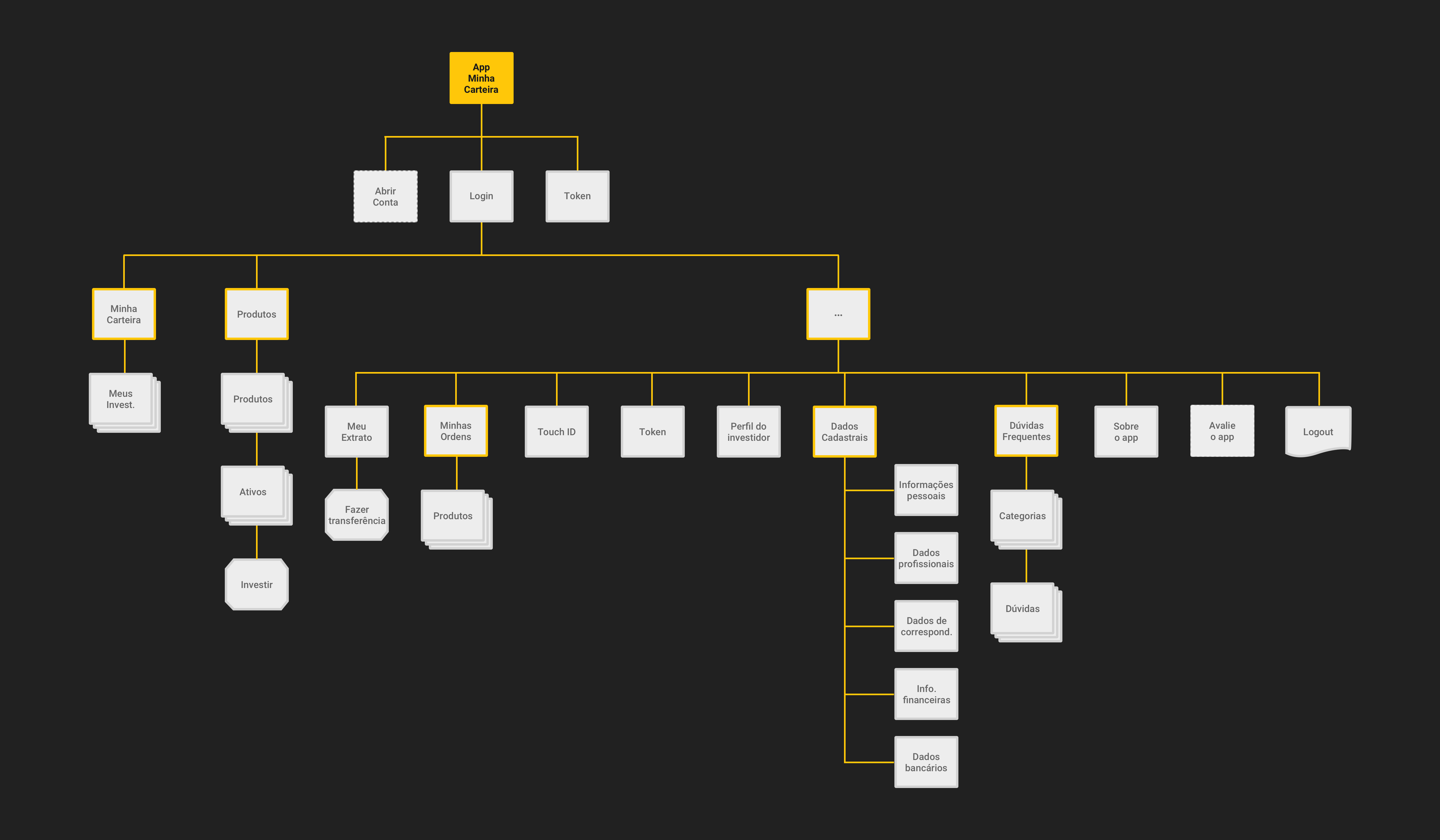
SITEMAP
SITEMAP
The new structure focuses on main user goals: follow their investments and invest in new products.
The new structure focuses on main user goals: follow their investments and invest in new products.
The new structure focuses on main user goals: follow their investments and invest in new products.
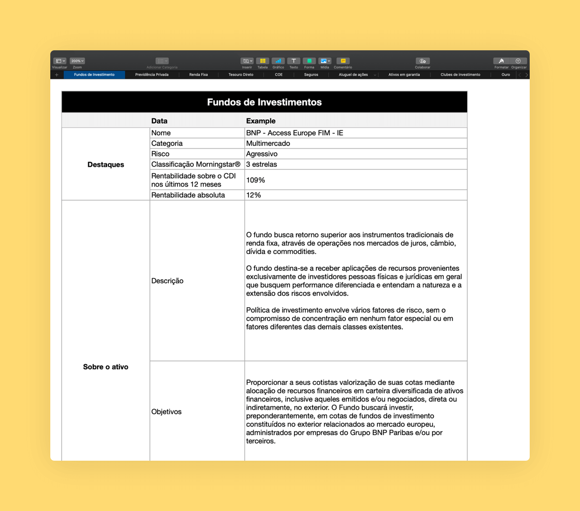
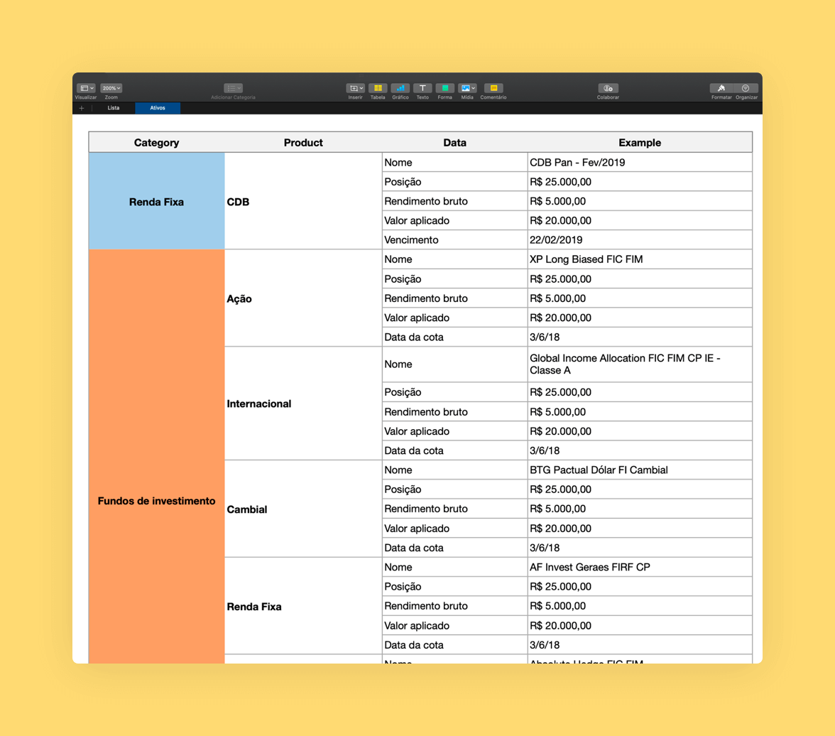
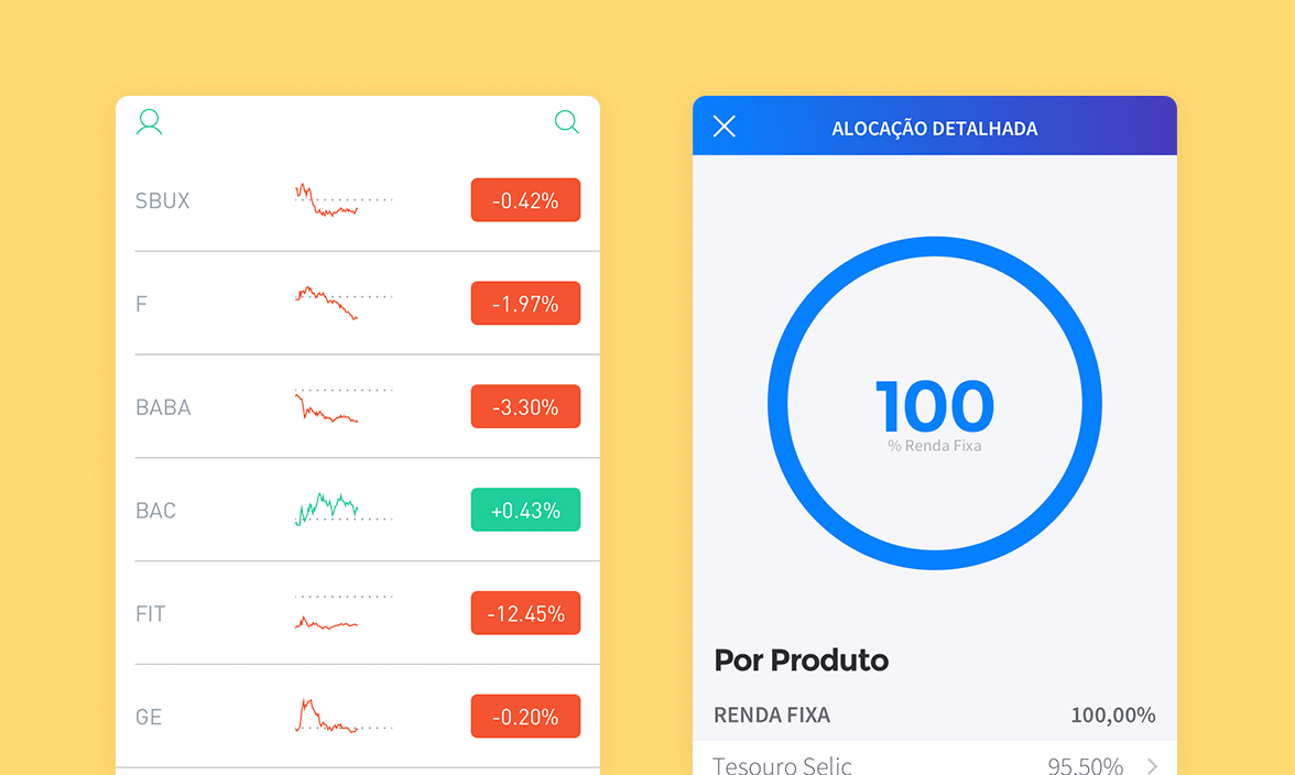
PRODUCT DATA MAPPING
PRODUCT DATA MAPPING
PRODUCT DATA MAPPING
We mapped all the available product data to analyze their importance and to help us to make better decisions aligned with user goals.
We mapped all the available product data to analyze their importance and to help us to make better decisions aligned with user goals.
We mapped all the available product data to analyze their importance and to help us to make better decisions aligned with user goals.
We mapped all the available product data to analyze their importance and to help us to make better decisions aligned with user goals.
DATA MAPPING TO PRODUCT CARDS
DATA MAPPING TO PRODUCT CARDS
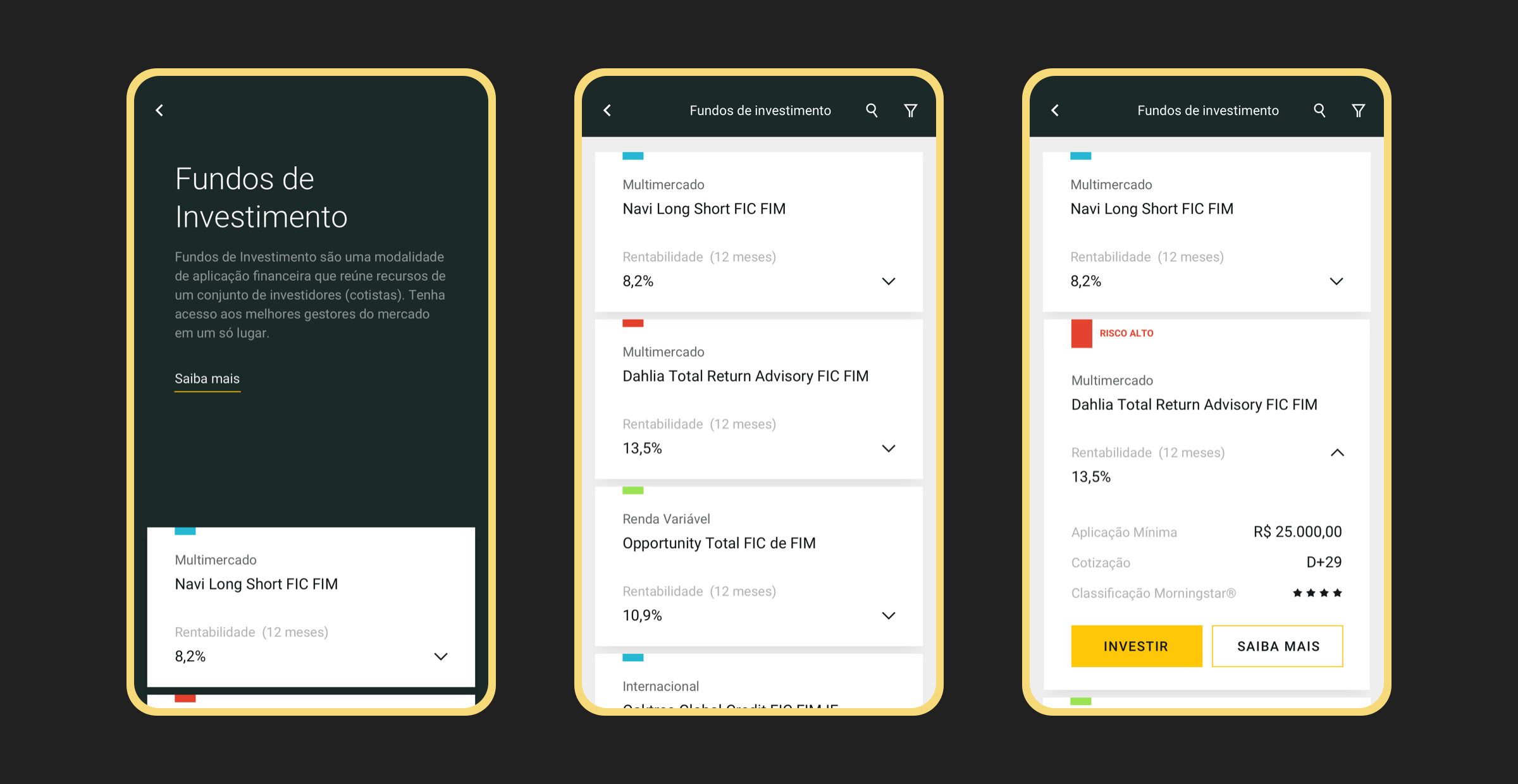
After mapping product data, we chose which ones would be shown in product cards based on their importance and relevance to user decisions.
After mapping product data, we chose which ones would be shown in product cards based on their importance and relevance to user decisions.
After mapping product data, we chose which ones would be shown in product cards based on their importance and relevance to user decisions.
Interface
Interface
Interface
Interface
Interface
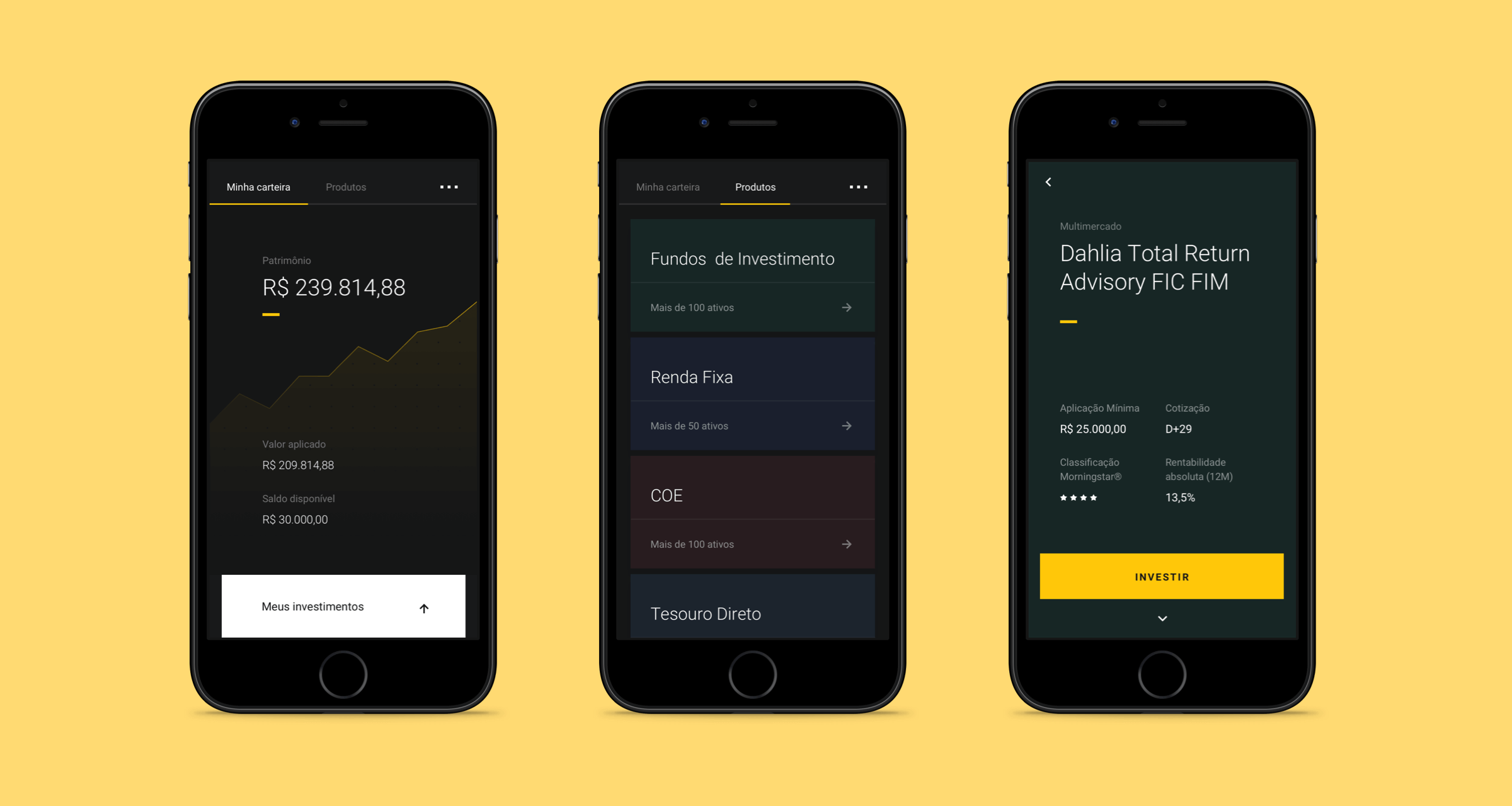
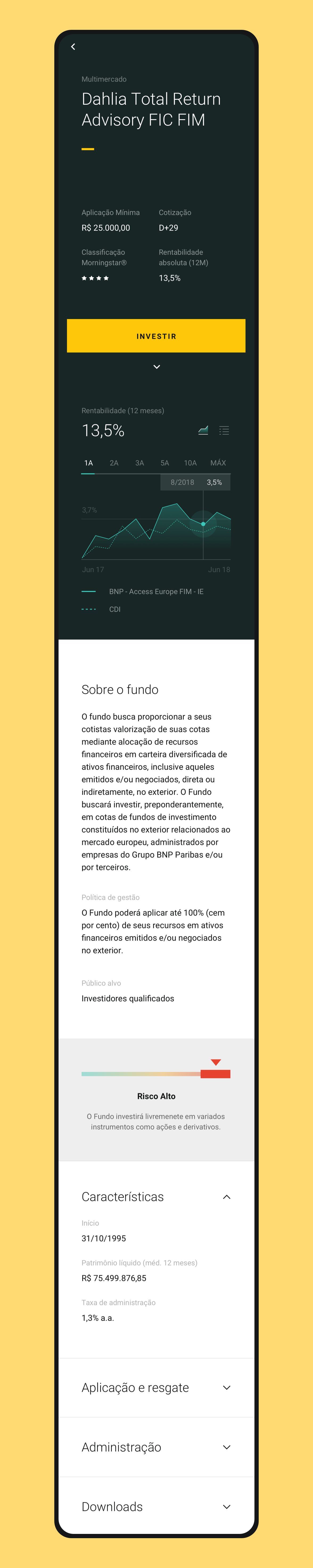
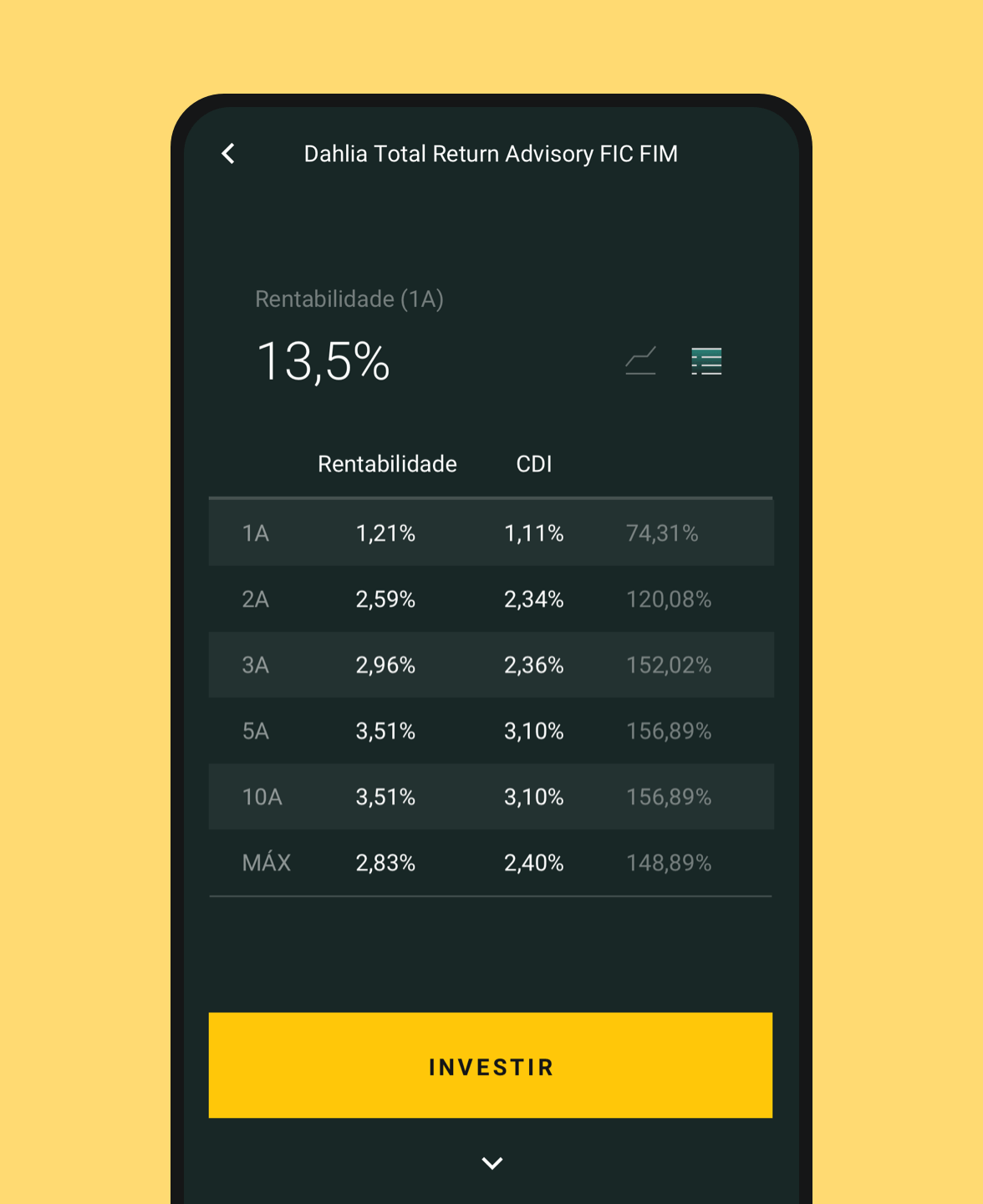
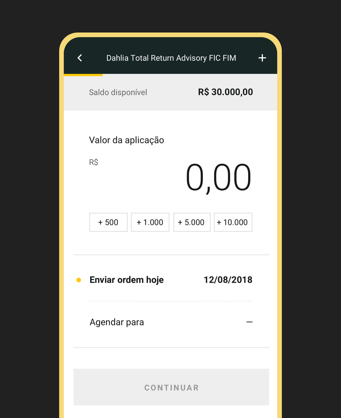
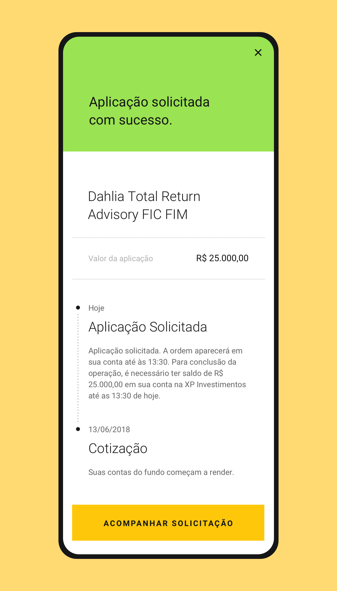
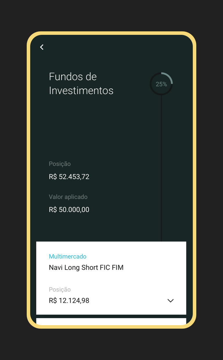
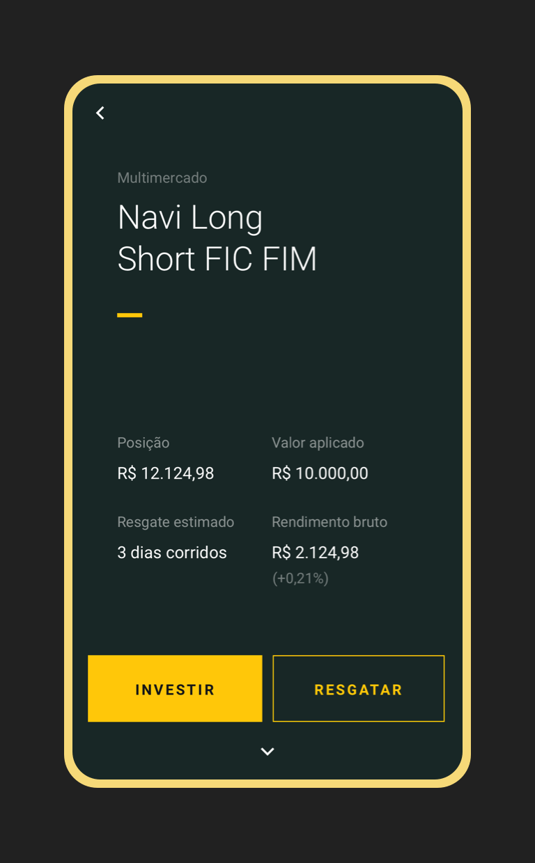
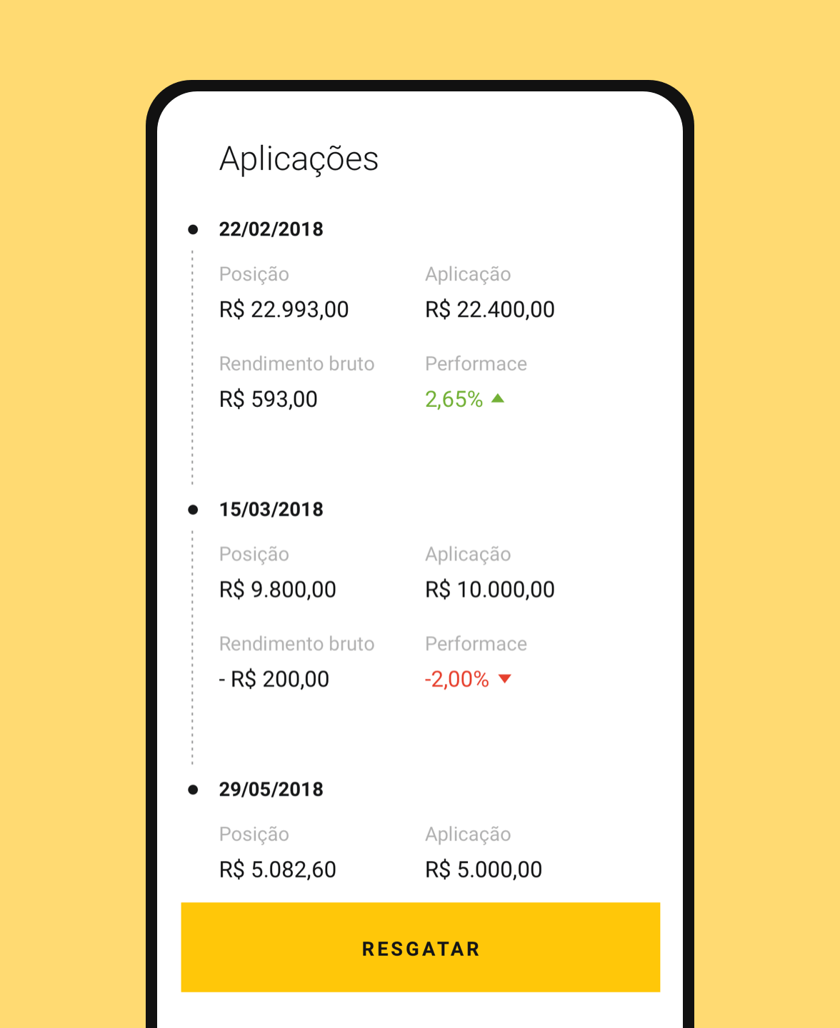
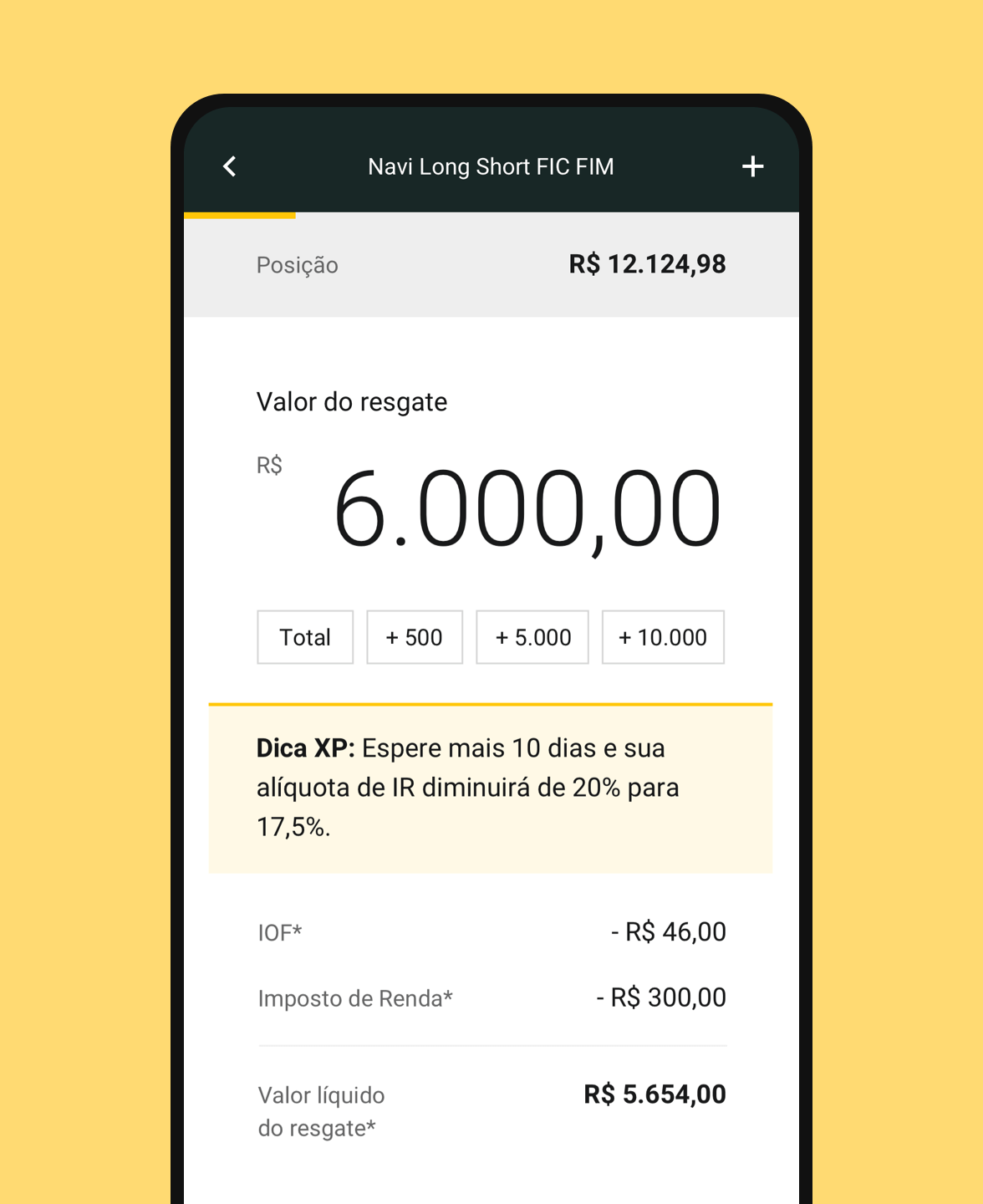
With the strategy and the information architecture defined, it was time to think about the interface. First, we focused on the navigation and in the main pages, like "Minha Carteira" and "Produtos" landing. Later we designed the product page template and the investment and withdrawal flow. Lastly, the login, the token page and the secondary areas, such as account statement and profile. The whole process went through hand-made sketches, refinement in wireframes, application of visual design and development of navigable prototypes.
With the strategy and the information architecture defined, it was time to think about the interface. First, we focused on the navigation and in the main pages, like "Minha Carteira" and "Produtos" landing. Later we designed the product page template and the investment and withdrawal flows. Lastly, the login, the token page and the secondary areas, such as account statement and profile. The whole process went through hand-made sketches, refinement in wireframes, application of visual design and development of navigable prototypes.
With the strategy and the information architecture defined, it was time to think about the interface. First, we focused on the navigation and in the main pages, like "Minha Carteira" and "Produtos" landing. Later we designed the product page template and the investment and withdrawal flow. Lastly, the login, the token page and the secondary areas, such as account statement and profile. The whole process went through hand-made sketches, refinement in wireframes, application of visual design and development of navigable prototypes.
With the strategy and the information architecture defined, it was time to think about the interface. First, we focused on the navigation and in the main pages, like "Minha Carteira" and "Produtos" landing. Later we designed the product page template and the investment and withdrawal flow. Lastly, the login, the token page and the secondary areas, such as account statement and profile. The whole process went through hand-made sketches, refinement in wireframes, application of visual design and development of navigable prototypes.
With the strategy and the information architecture defined, it was time to think about the interface. First, we focused on the navigation and in the main pages, like "Minha Carteira" and "Produtos" landing. Later we designed the product page template and the investment and withdrawal flow. Lastly, the login, the token page and the secondary areas, such as account statement and profile. The whole process went through hand-made sketches, refinement in wireframes, application of visual design and development of navigable prototypes.
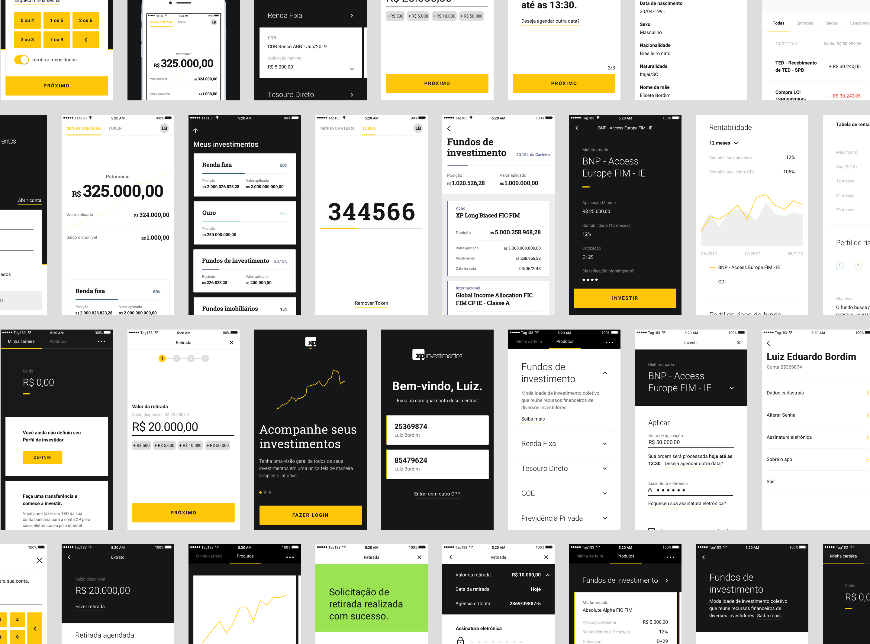
WIREFRAMES & VISUAL STUDIES
WIREFRAMES & VISUAL STUDIES
WIREFRAMES & VISUAL STUDIES
As a crucial step of the process, a lot of structural, navigational and visual studies were made.
As a crucial step of the process, a lot of structural, navigational and visual studies were made.
As a crucial step of the process, a lot of structural, navigational and visual studies were made.
PROTOTYPES
PROTOTYPES
PROTOTYPES
We prototyped most of our concepts and presented them to users to receive their feedback and make improvements.
We prototyped most of our concepts and presented them to users to receive their feedback and make improvements.
We prototyped most of our concepts and presented them to users to receive their feedback and make improvements.
Many visual studies were made to define a style guide aligned with XP branding and the premium users profile. We decided on a clean identity, focused on XP's black and yellow. Also, each category of product has a particular color to differentiate themselves. We created a color guide based on investment risk, warm colors for products with more risk and cool colors for less risk.
Many visual studies were made to define a style guide aligned with XP branding and the premium users profile. We decided on a clean identity, focused on XP's black and yellow. Also, each category of product has a particular color to differentiate themselves. We created a color guide based on investment risk, warm colors for products with more risk and cool colors for less risk.
Many visual studies were made to define a style guide aligned with XP branding and the premium users profile. We decided on a clean identity, focused on XP's black and yellow. Also, each category of product has a particular color to differentiate themselves. We created a color guide based on investment risk, warm colors for products with more risk and cool colors for less risk.
Many visual studies were made to define a style guide aligned with XP branding and the premium users profile. We decided on a clean identity, focused on XP's black and yellow. Also, each category of product has a particular color to differentiate themselves. We created a color guide based on investment risk, warm colors for products with more risk and cool colors for less risk.
Many visual studies were made to define a style guide aligned with XP branding and the premium users profile. We decided on a clean identity, focused on XP's black and yellow. Also, each category of product has a particular color to differentiate themselves. We created a color guide based on investment risk, warm colors for products with more risk and cool colors for less risk.
TEAM
Luiz Bordim • UX Specialist
Allan Co • Sr. Product Designer
Julliane Alberigi • Product Designer
Larissa Levy • Product Manager
NEXT PROJECT • READYREFRESH
NEXT PROJECT • READYREFRESH